
A Quick Celebration of Those Star Trek Discovery Posters
We’re now close enough to reasonably start counting down to the premiere of Star Trek Discovery in weeks instead of months or years. We’ve had a pretty consistent stream of information about the upcoming CBS All Access exclusive, including a couple of very promising trailers for the series that we reviewed in one Supplemental Log Episode #002 here: Star Trek Discovery Trailer and Supplemental Log Episode #003.
But one of my favorite things that have come out about the series are these gorgeous promotional posters.
First, we got the basic show logo that was originally released last year as this:

A rusty colored Starfleet insignia with sharp corners that looks a little bit chubbier and squat than the symbol of Starfleet that exists in my heart. It’s a fit for the “grittier” description the showrunners were using early on, but also seemed to make an effort to channel the font for the franchise name itself that was used in J.J. Abrams 2009 “Star Trek:”

Then in 2017, they released an updated version that is much more my style. It’s bright! That insignia with the rounded corners looks more sleek and elongated than in the previous version, and the new gold color is vibrant, and feels like it belongs more in the hopeful and optimistic Star Trek: The Next Generation feel that I find myself gravitating towards:
But since the release of the series logo, they’ve also been releasing posters that have got me amped. The first has show star Sonequa Martin-Green doing the classic “Live Long and Prosper” gesture. She’s a human doing a Vulcan salute? Intrigue! The Discovery flying vertically out of the planet and star cluster is gorgeous, but I’m less than enthusiastic about that lens flare off the moon’s surface. The 2009 film was severely mocked for what was perceived as its overuse of lens flare, so incorporating into your poster one of the biggest complaints about the most popular thing in the Star Trek universe in the last decade seems an odd choice.

But the posters only get better from here.
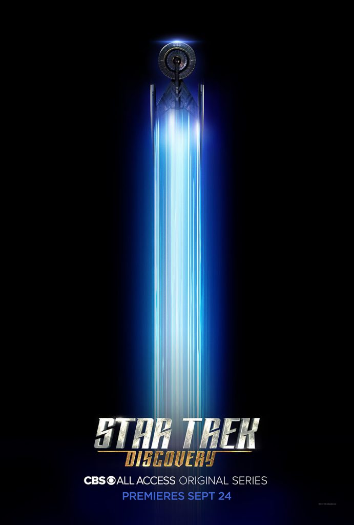
This one is the simplest, and also the one most likely to make its way onto my phone as a wallpaper with the Discovery’s brilliantly colored warp trail cutting the darkness of this poster in half.
Below, we have the two posters they revealed for at San Diego Comic Con.
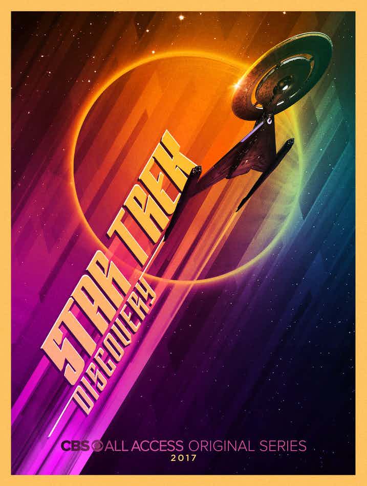
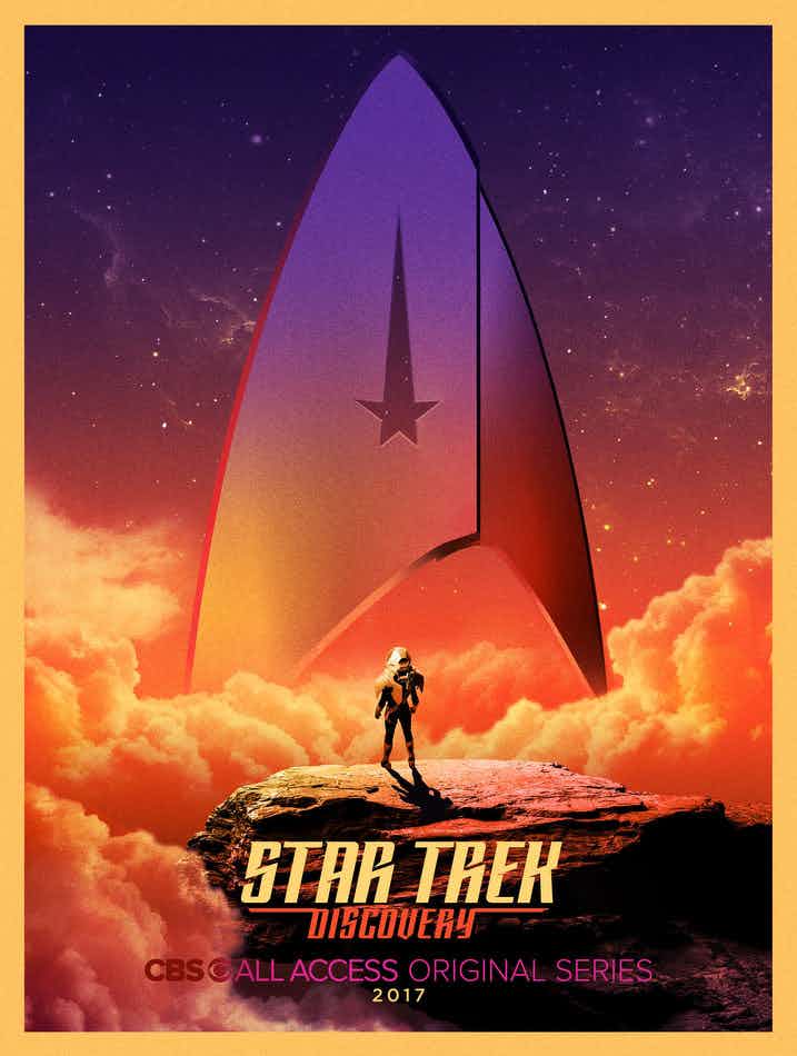
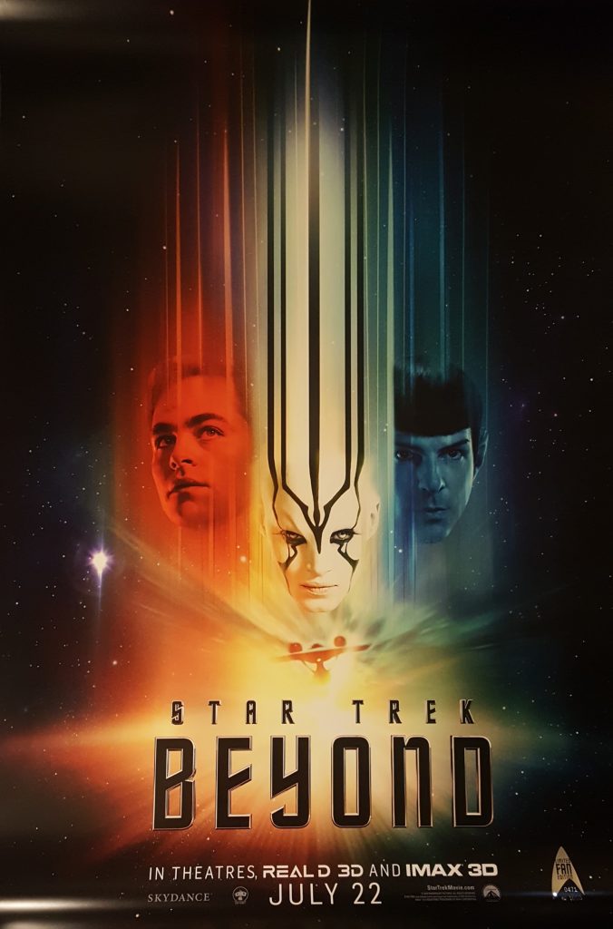
Both spectacularly colored in that rainbow scheme that dominated many of the films based of the Original Series, and was also referenced in the latest Star Trek Beyond promotional materials:
And finally, we have what may be my favorite of them all. Close up of Martin-Green’s Lieutenant Commander Michael Burnham looking towards the stars, with what looks to be the image of the little person in the space suit from the above poster doing the same. So much optimism! Such hope! This poster makes me feel like Star Trek: Discovery’s idea about what makes Star Trek so amazing is very compatible with my own perceptions. While this might not be the most exciting image to have as your wallpaper, it is easily the one that inspires the most confidence in me about the promise of Star Trek: Discovery.